E-Control Systems is a wireless temperature monitoring system that services the food, healthcare, life science, and retail industries.
E-Control Systems
PROJECT SCOPE
- Explore branding and visual systems
- Re-think content and site architecture to help communicate product offering
- Implement an e-commerce functionality
CHALLENGE
Conduct a visual exploration of the E-Control Systems brand and translate the newly developed visual language across the company’s core website.
Competitors at a glance
I began the brand exploration by glancing at the competitive landscape. I examined direct competitors and looked for patterns across their visual strategy and website architecture.
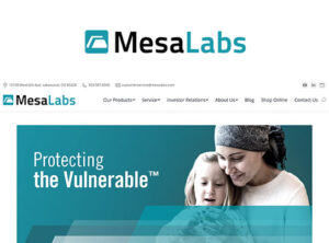
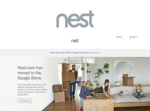
The competitive landscape was limited, and only a few direct competitors were identified: Monnet, Mesa Labs, and Wink. To bridge the gap, I looked at a few indirect competitors that fell within the IoT space including Nest and Sonos. Through my analysis, I was able to identify some key visual patterns.

Typography
Common typeface styles included san serifs, most typical for the digital space. The content hierarchy was balanced through font weights and sizes. They emphasized and de-emphasized content effectively, allowing the users to quickly digest the key information. In addition to this, brand colors were used to highlight keywords.
Colors
The majority of the competitors utilized a cooler color palette with a subtle base tone used for the background layers. A few brought in complementary accent colors to highlight important information, such as buttons, headers etc. All in all the competitors resemble a calming and reassuring presence through their color usage.
Layout & Visuals
Large, full-bleed images of the products dominated the competitor’s main site. Some product visuals were staged with people or within the product environment. This visual approach provided a quick look at the product offering and features. The majority used iconography to anchor the product’s key benefits and features.
IA & Patterns
Competitors leveraged a hierarchal top navigation system. The interface was supplemented with card and tile design. Direct competitors focused on breaking down the serviced industries and product benefits while indirect competitors led in with the product offering information.
IDENTIFYING DESIGN OPPORTUNITIES
Looking at the competitive landscape, I realized that many competitors struggled with explaining the product features and functions in a digestible manner. The product information was congested with busy infographics and complex diagrams. Taking that into consideration, I wanted my designs to lead in with simplicity, leveraging product photos to share key product features and uses, and keeping the nitty-gritty details nested within the product-specific pages.
In addition, photographic styles were highly industrialized, heavy, and dark. To pivot away from that approach, I’ve select visuals that are lighter and brighter in tonality, less staged, and capture real product usage and its environment.
Crafting the mark
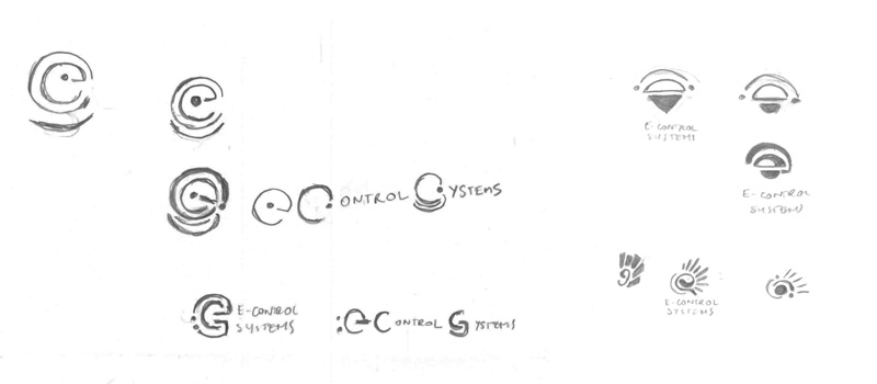
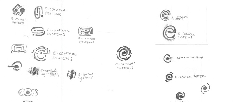
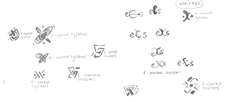
Throughout the logo exploration, I kept in mind the product’s key features and benefits.
VARIABLE
The “x” variable stands for the possibilities that come with the use of ECS’s monitoring solution. It captures the adaptability of this product.
SENSOR, CONNECTIVITY
The sensor creates a link between the wireless features and the in-app connectivity.
SIGNAL / RADIANCE
At the core of the ECS products are live communication updates triggered by the IntelliGate™ and IntelliSensor™ technology. The data is instantly sent to the user and safely stored.
Refining
Continuing the logo exploration, I refined the concepts and explored color schemes. Leveraging, what I have learned from the competitive analysis, I stayed on the cooler side of the color wheel. However, for one of the concepts, I crafted an analogous color pairing and blended the hues into a smooth gradient with the intention of differentiating ECS from the competition.
Exploring the visual approach
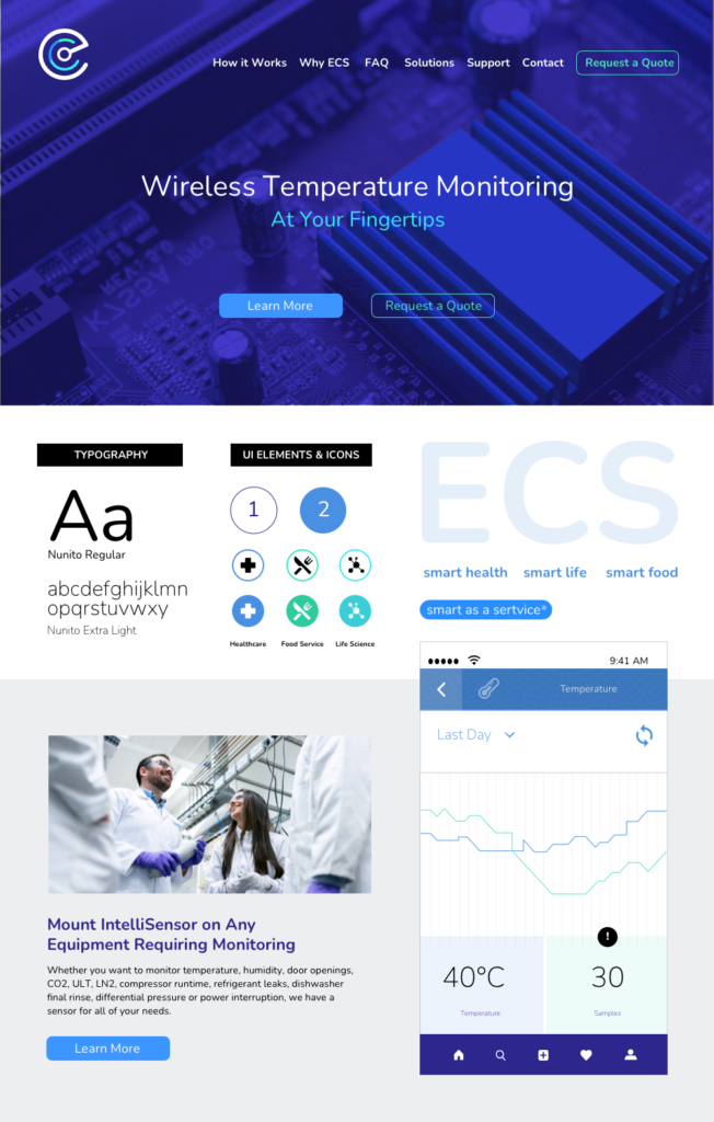
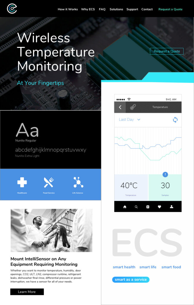
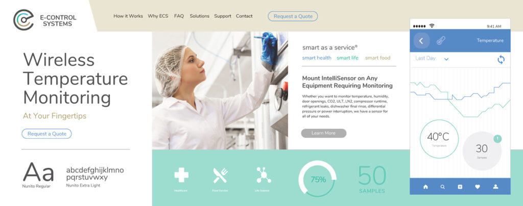
Due to budget and timing constraints, this project was heavily weighted on the client’s input. Upon the style tile review, the client wanted to hybridize elements from the dark and light themes. They enjoyed the blues but felt that the chosen hues were either too dark or too light. With that in mind, I explored a brighter blue and supplemented it with accents of green and teal. In addition to this, I’ve incorporated lighter, livelier, and humanized photography and eliminated the heavy and dark use of overlays.
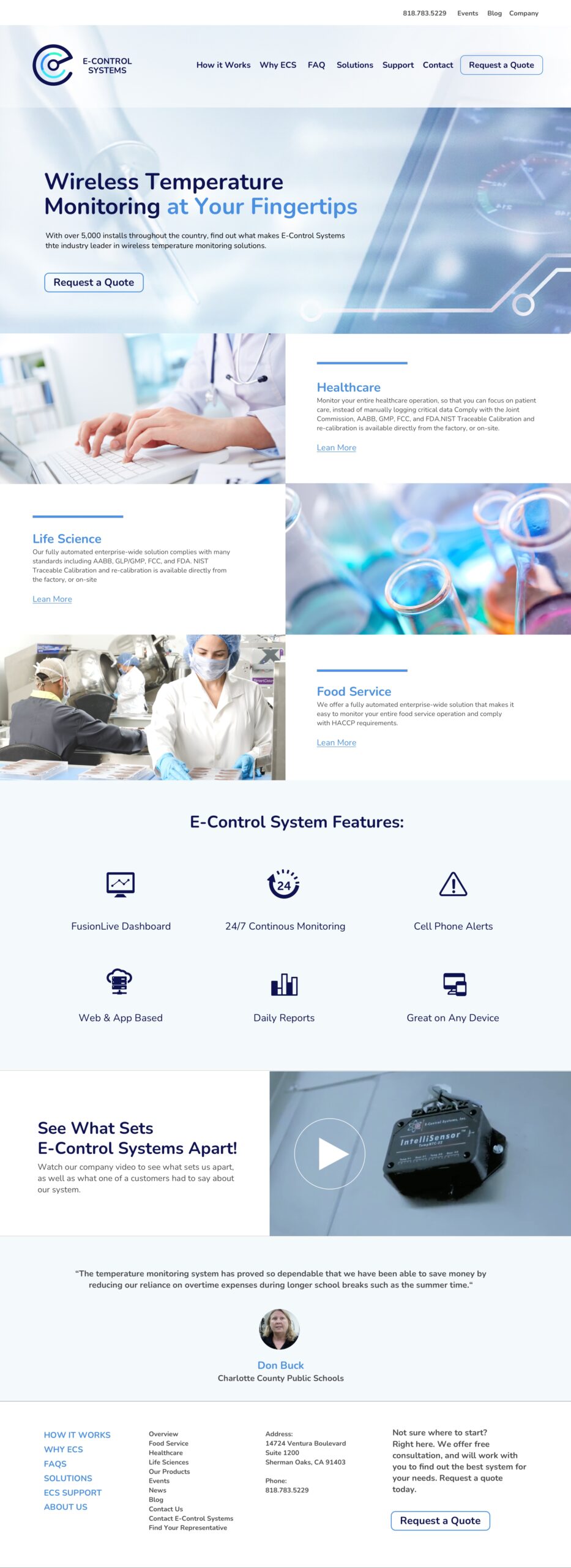
The visual direction of E-Controls was anchored with blues, teals, and greens, used as accent hues. The overall design was inspired by digital patterns, isometric textures, and image overlays. The designs were accentuated by sharp edges, clean and minimalistic iconography, and full-bleed visuals. Based on the takeaways from the competitive analysis, I’ve decided to explore both, a dark and a light theme.
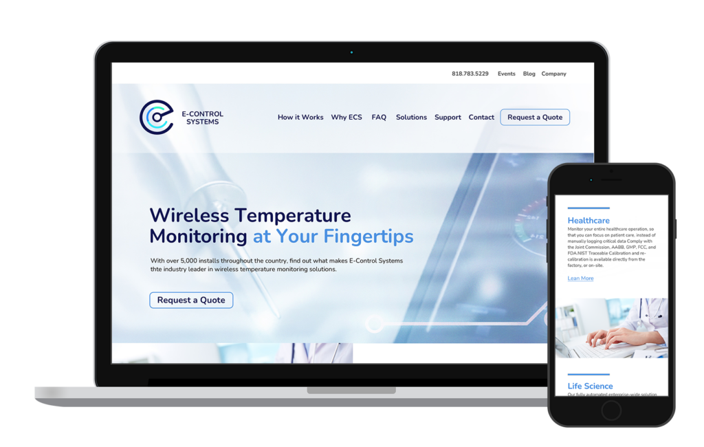
Revamping the company site
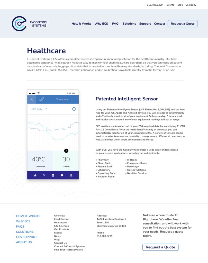
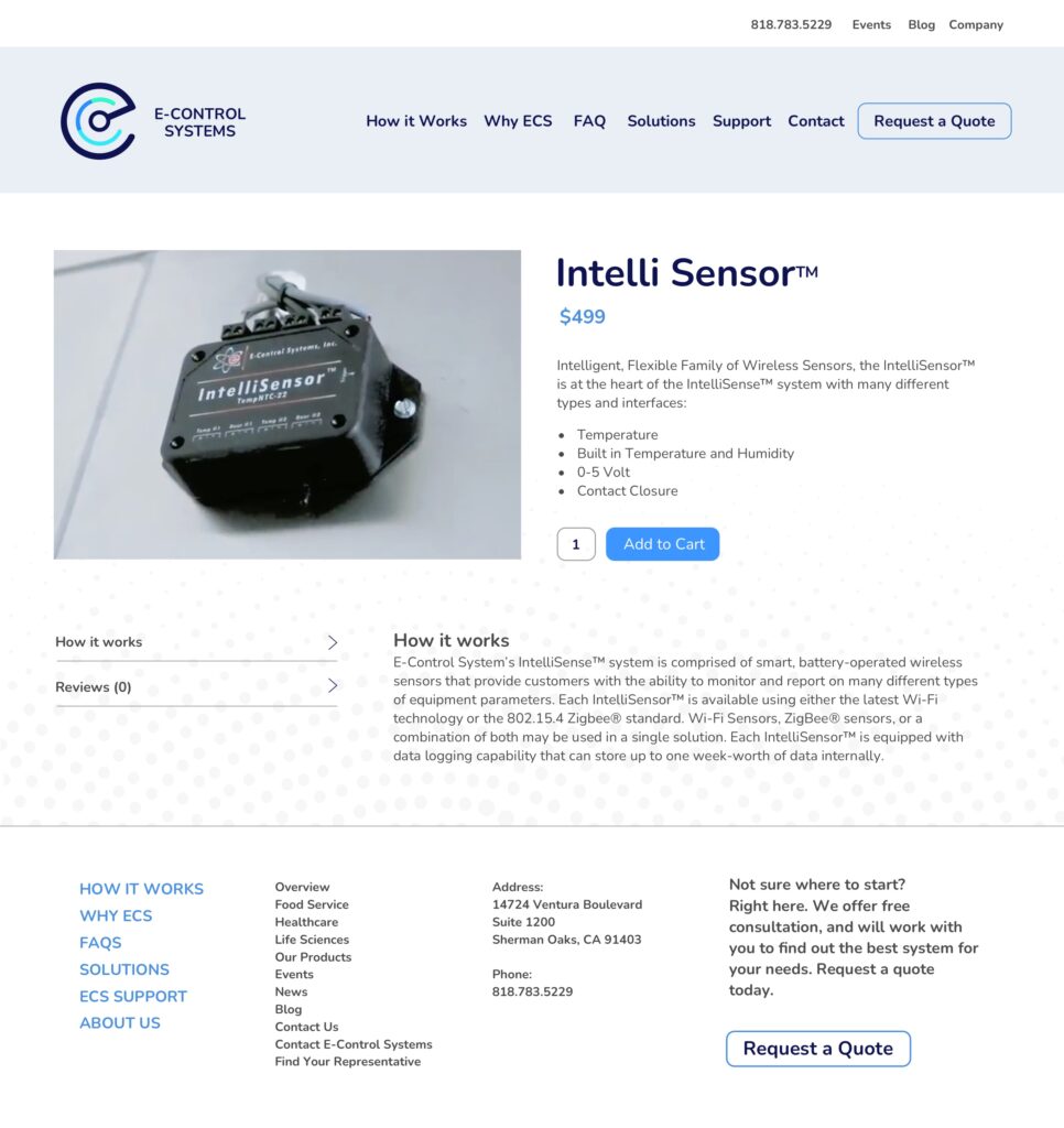
After evaluating the existing site, I recognized that the content lacked an explanation of how Intelli Sensor® supports and services specific industries. I rearranged this information into large tile blocks and added more product facing information. I’ve also leveraged iconography to highlight key product features.
Future recommendations
A visual direction was established but still needed further validation. The process lacked user input and feedback. As one of the recommended future steps, I would revisit the design solutions and run desirability and usability testing on the site to help further refine information hierarchy, navigation, and the visual language.
